Colour Theory in Web Design
Colour theory in web design is unarguably one of the most important aspects when it comes to designing your site. Get it wrong and you could immediately be putting off, or losing, potential customers.

“85% think that colour increases brand recognition” – WebPage FX
In this article, we’re going to take a look at the psychology behind colour choices, different types of colour schemes and the patterns used to create them. We’ll also take a peek at some useful tools which can help when creating colour sets, allowing you to test how well they’ll work on the web.
Colour Psychology in Web Design
Let’s dive straight in and look at the psychology of colour and how different colours can portray certain emotional or intellectual connections for users.
The physiology behind colour choices is massively important, and you don’t just have to think about the connotations in your local area but also worldwide. Your target audience is one of the most important factors to take into consideration when choosing your colour scheme.
For example: In China red symbolises good luck and prosperity with red envelopes being offered at new year celebrations. However, in other places around the world, red is used to represent danger.
It’s also important to think about how your competitors and the wider markets use colours. This is important to know that you’re not making connections with a business or subject that you didn’t intend to.
For example: If you use a yellow semi-circle on a red background, before you know it you’ll be starting to represent the infamous McDonald’s Golden Arches.
Read on to learn more about how different colours and tones make us feel and what we associate each with. We’ve split the main colours into three groups; warm colours, cool colours and neutral colours.
Warm Colours
Red is one of the most “physical” colours. Known mainly for its immediate connotations towards blood, but this also leads it to represent love and passion. The colour also has a strong connection to warnings, with road signs across the globe utilising the colour. This has also gravitated its way into web design with a large proportion of error warnings utilising red hues.
Orange can be used to represent youth and happiness, a powerful colour which can help to display confidence and enthusiasm. In short, orange is a fun and energetic hue. In contrast to this, orange can also be used to represent ignorance and instability.
Yellow is another emotional colour representing creativity and energy. It can create a feeling of optimism and give a boost of freshness to a design. In contrast to this, it can often have medical connotations, being used to represent cowardice (Yellow-bellied) and has a strong connection with warning and hazard signs.
Cool colours
Green has immediate connotations with nature and works extremely well to display environmental friendliness. Green is also the colour of envy and jealousy, although nature will always have the strongest connection to this colour.
Blue is known to represent intelligence and trust. The colour can create a calm atmosphere and is often associated to faith and religion. This “smart” colour is one of the most used colours on the web. In fact, it is the main colour used by some of the worlds biggest digital brands, after greys and blacks.
Purple has a strong connection to royalty, along with conveying wisdom. It is a soothing colour, with a calming effect, explaining why it is often seen on beauty products.
Neutral colours
Black has so many connotations. It can create a sense of class and formality, often used with fashion brands as it works well with almost all other colours. Black also has many negative connotations and can be seen as an evil colour and is used to represent death.
White is a pure colour, which has an immediate connection to innocence. It’s a fresh colour and it also works with most other colours in the palette. There are very few negative connections with the colour.
Grey is a secure colour, representing strength and reliability. It can also help to convey intelligence and balance due to its position between black and white. It can become a sad and gloomy colour, with darker tones of the colour having negative connections to bad weather.
Brown can be a friendly colour but has immediate connections with the outside world. It can also often give a sense of uncleanliness.
Colour Scheme Structures
Colour scheme structures are a set of patterns many designers will use when creating a new colour scheme. The scheme ensures they’re choosing colours that work well together. We’ll take a look at four of the main harmonies for combining colours and how to create each.
Monochromatic Colour Schemes

These colour schemes are created by utilising a base hue, then using tints and shades to brighten and darken the colours. However, be mindful that it won’t offer the contrast that is really needed when working with colours on the web.
Analogous Colour Schemes

These colours are situated next to each other on the colour wheel and can display the transition between two different colours to great effect.
Complementary Colour Schemes

These colours sit opposite each other on the colour wheel, and can often be used together with great effect. This is one of the simplest patterns used to create the base of many colour schemes.
Triadic Colour Schemes

These colour schemes are created by selecting 3 colours that are equally distanced on the colour wheel.
The best colour schemes cleverly work one or more relationships together. For instance by selecting complementary colours and then using a monochromatic theme to build out the other colours of the theme.
Tools for building colour schemes
You may think that you need a £1000 Pantone reference guide to be able to create your own colour schemes, but this couldn’t be further from the truth.
If you’re designing for the web there is a whole host of tools available to help create colour relationship patterns.
Let’s take a look at some of the best tools freely available on the web. These will help you understand whether your new colour scheme is effective for use online.
Adobe Color
Adobe Color is an excellent tool for creating your own colour schemes, with a range of great features that make it a go-to tool for many designers.
Tip: It’s a good idea to create a free Adobe account so you’re able to save your creations and go back to them at a later time.
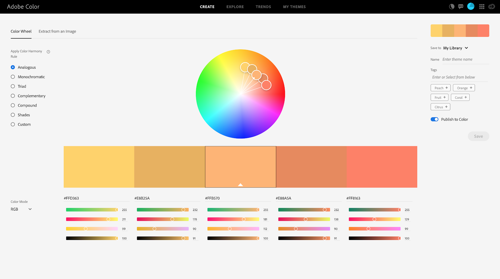
On the platform, you’re able to view colour schemes that other users have made public. This can be a great starting point to inspire your own colour decisions. You also can upload a photo and produce a set of colours based on this which can be super helpful when trying to match your colours with physical objects
Good to know: Adobe Color is available as a mobile app so you can capture colour combos on the go!
The tool allows you to choose a single colour and then use the different patterns to create your colour scheme. You can then save and share these through the platform. Adobe users will be able to find saved colour schemes within Adobe design software through the creative cloud library panel.
Paletton
Paletton is another online application, similar to Adobe Color, but focuses less on the sharing of colour schemes between users and applications. It does, however, have some other great features.
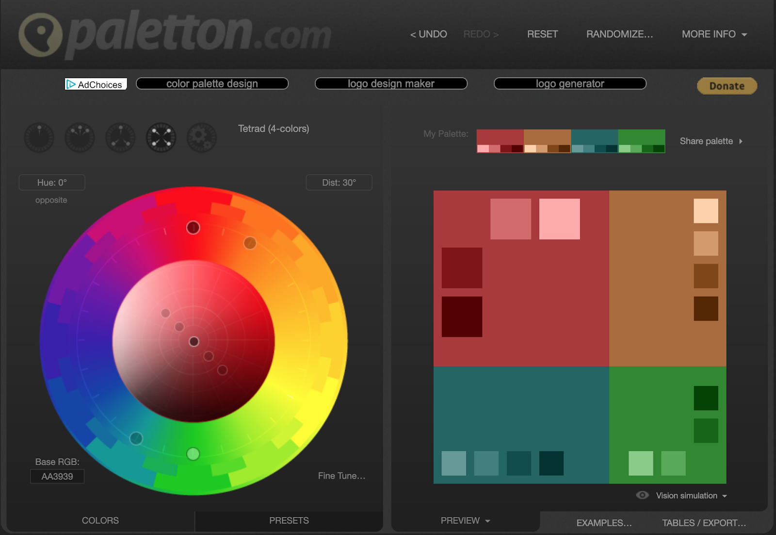
Paletton allows you to get detailed colour information, and build from this. The tool works using a Red, Yellow and Blue setting effectively create colour schemes that work across both print and digital projects.
Using Colour Theory Online
Choosing colours to use on your site isn’t the same process as choosing colours for a printed product. Although a lot of the considerations are similar, you have to go a bit further to think about how users conditions can affect the appearance of your colours on screen.
When you create a book you can have a permanent background colour to the page and the “brightness” is consistent no matter who is reading it.
However, when we move over onto online projects, the page background can be configured to the users’ preferences. Brightness settings are often different on every laptop. So you must consider how these user changes will affect the colours you choose to reflect your brand.
Complementation
Choosing colours that complement each other can be a difficult and lengthy task, but it’s important that this is done well in order to represent your brand online in the best way possible.
There will be colours that will complement your branding and we’re not just talking about complementary colours. But rather choosing tones that work well no matter which pattern you use to produce your colour scheme.
Contrast
Getting the contrast levels correct between colours is vital for the usability of your site. Low contrast text can be very difficult to read, this can direct users away from your site never to return.
There are times when low contrast colours can be used artistically but you must ensure that you’re not hiding key information in low contrast blocks.

The examples above show how low contrast text becomes very hard to read. The best solution is to simply switch the foreground text to a darker hue when being placed over a light background colour.
It is an important consideration when assessing the accessibility of your site. By using colours that have a low contrast you could be blocking out a proportion of users.
An estimated 4.5% of British males suffer from some sort of colour blindness or colour vision deficiency.
This number is lower in women but accounts for around 300 million people worldwide, so its worth making sure that you’re not restricting their usage of your site.
There are some great tools for testing the contrast of the colours on your site. This is one of our favourites: WebAIM’s Contrast Checker.
This tool allows you to enter your chosen background and foreground colours and will tell you how well they contrast with each other and if they allow for high readability.
WebAIM’s Contrast Checker takes other factors like text size into consideration. Certain colours that don’t contrast well at small sizes may contrast enough when used for larger text, meaning that those titles can have lower contrast than main bodies of text.

Vibrancy
Vibrant colours can work amazingly well at grabbing users attention and making them take note. They work well in graphics and when a single vibrant colour is paired with a neutral site theme to make your call to action stand out.
You must ensure not to take this too far though. Although highly vibrant graphics can look awesome, they can also have a negative effect. Before using vibrant colours in your design, make sure you know your customers well and think about how your target demographic might react to bright, in-your-face tones.
Accessibility
Contrast and vibrancy both have an effect on the accessibility of your site. If you single out users with conditions like colour blindness you may find that your site isn’t as inclusive as you once thought.
There are lots of free tools out there which you can use to check the accessibility of your site, but we’re going to look at our favourite.
Toptal Color Blind Checker
www.toptal.com/designers/colorfilter/
This tool allows you to enter your site address and see how it is going to appear to users with variations of colour blindness.

Using this tool will help you to discover which areas of your site might be difficult to navigate for certain users and allow you to improve your users’ experience by taking action with the colours on your site.
Summary
Now we’ve covered the basics of colour theory in web design, why not try using some of the common colour relationship rules to create your own colour scheme? Make sure to try out some of the great tools we mentioned to test how well your colour scheme will work for the web.
Our team of designers and developers are experts in creating beautiful websites with branding and colour schemes that work both online and offline. Get in touch today for more information about our graphic and web design services.
Get in touch
Kanuka Digital design websites that convert. If you’d like design expertise to refresh your branding and colour schemes, get in touch with the team today.
Drop us a line on 01785 279985
Send us an email hello@kanukadigital.com